top of page

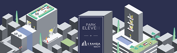
A unified visual identity across five concurrent developments.
On-Site Visual identity for S Raheja Realty
S Raheja had multiple residential projects under construction simultaneously, each located within close proximity. While each development operated independently, the lack of a cohesive visual language meant there was no strong, unified brand presence on the ground.
The opportunity was to create a system that would bring these sites together — ensuring they were immediately recognisable as part of the same brand, while still allowing for individual distinction.
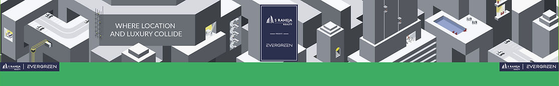
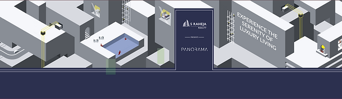
A unified identity across multiple sites
Five concurrent developments required a consistent visual presence. The system ensures each site is immediately recognisable as part of the same brand.
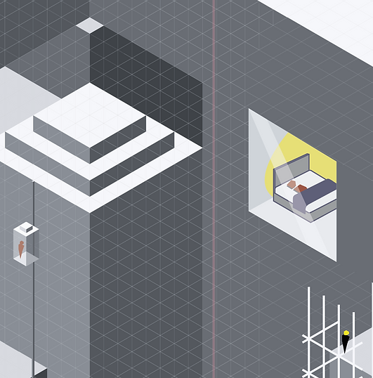
Distinct, yet part of a larger whole
A modular graphic language allows each site to carry its own variation, while remaining visually connected through a shared system.
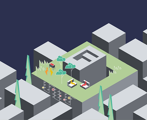
Designed for visibility and recall
Scaled for real-world impact, the identity creates strong street presence and reinforces brand recall across locations.
THE SYSTEM


A flexible visual language built for scale.
-
A modular grid enables consistent layouts across varying site dimensions
-
A restrained colour palette ensures coherence across locations
-
Geometric forms create a strong, recognisable visual signature
IN APPLICATION
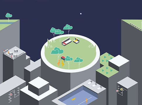

Consistency across sites. Clarity on the street.
The system adapts seamlessly across hoardings, entry points, and environmental graphics — creating a continuous brand presence across the neighbourhood.
Each site retains its own identity, while contributing to a larger, unified visual narrative.
ON GROUND IMPACT


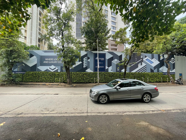


Designed for visibility in real-world conditions.
Placed within active urban streets, the branding is experienced at speed — by pedestrians, drivers, and passersby. The bold forms and structured layouts ensure legibility and recall, even in fleeting moments.
bottom of page